This is the fifth part in my series of articles on CSS layout fundamentals. Designed to rid the world of table-based layouts forever, you can find the other parts here:
- Part 1: the box model
- Part 2: the visual formatting model
- Part 3: block and inline boxes
- Part 4: positioning
In addition to the four position types introduced in CSS2, CSS supports another method of positioning content called floats. Floated content is the last fundamental technique we’ll cover before looking at implementing some CSS-based layouts.
Floats
At its simplest, floating a box in CSS means moving it to the left- or right-most position possible in its containing box, without overlapping any other floated content. You do it by setting the float CSS property to either ‘left’ or ‘right’; the default value is ‘none’.
Here’s an example which floats the second inline element to the left. (The original layout prior to applying the float is as shown in the normal flow example in the earlier articles.)
inline#2 {
    float: left;
    margin-right: 1em;
}
Floated content example
As you can see from the example, the floated box is removed from the normal flow. Line boxes inside the containing box wrap around the floated box or boxes. Once the floated element ends, element #4 is positioned back on the left edge of the container. Floated boxes are treated as block boxes for layout purposes, regardless of the value of their display property.
The classic example of floated content is positioning an image on the left- or right-hand side of an article. I use this technique quite a lot in articles on my blog (example). This is what the float functionality is designed for in CSS.
Issues with floats
The technicalities around positioning floats in a web page are many. Because the initial CSS specification didn’t clearly define all the edge cases around floated layouts, there were different implementations from different browsers. In the following years, Internet Explorer didn’t have many updates, so many bugs with floated layouts are still prevalent in browsers widely used today.
A discussion of the issues around floated layouts and getting them to work perfectly in Internet Explorer as well as the modern browsers is enough to require another series of articles. So rather than give a comprehensive coverage of all these issues, I’ll just cover two of the most important ones. For more information, I’d recommend a thorough reading of the specification and other online documentation like Position is everything.
The two main problems people find with using floats for layouts in any browser is handling those boxes which either contain or are adjacent to floated content. Float boxes can extend beyond the bottom of the containing box if the other content in the box isn’t taller than the float. A floated box can also overlap the borders or margins of adjacent block boxes in the same container. Below is an example of both problems.
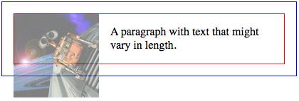
CSS float layout, looking somewhat broken
Assuming the author wants a layout where the borders of the container and the paragraph are in logical places, this layout seems a bit broken. I’ve made the image transparent so the problems are obvious. The red paragraph border goes behind the floated image when it should have its left border slightly to the right of the image. The blue container border doesn’t extend far enough down, so it also goes behind the floated image.
Fixing adjacent boxes
Let’s look at the red paragraph border problem first. The reason the paragraph border appears behind the image is because floats don’t reposition block boxes that are adjacent to them. In this example, the floated image is only pushing the line boxes inside the paragraph across. So the text is pushed to the right, but the actual paragraph box still stretches across the full width of the container.
The fix for this issue comes from a very well-hidden paragraph in the floats section of the CSS 2.1 specification:
The border box of a table, a block-level replaced element, or an element in the normal flow that establishes a new block formatting context (such as an element with ‘overflow’ other than ‘visible’) must not overlap any floats in the same block formatting context as the element itself.
So to prevent our paragraph block from overlapping the floated content, the solution is to create a “new block formatting context”, in CSS specification author terminology. Sounds tricky, eh? Fortunately, it isn’t that hard. New block formatting contexts are created by any block which meets these criteria:
- is floated
- is absolutely positioned
- has a
displayproperty value of one of more unusual flavours (inline-block, table-cell, etc.) - has its
overflowproperty set to something other than visible.
The last option is the one that is easiest to do in most cases: setting overflow: auto on our paragraph will create a new “block formatting context”, and render the paragraph border in the right place.
p {
    overflow: auto;
}
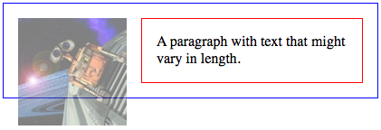
CSS float layout, now with paragraph border fixed
Fixing containing boxes
Now, the blue border of our container box is still in the wrong place. Because the paragraph contents is not as tall as the image, the container seems to collapse to the height of the paragraph. Thus the blue border still appears behind the image.
The CSS specification provides a way for boxes which contain floats to have a height which encompasses the full height of any contained floated content. This is covered by sections 10.6.6 and 10.6.7 of the specification.
This section applies to:
- Block-level, non-replaced elements in normal flow when ‘overflow’ does not compute to ‘visible’ (except if the ‘overflow’ property’s value has been propagated to the viewport).
…
In addition, if the element has any floating descendants whose bottom margin edge is below the bottom, then the height is increased to include those edges. Only floats that are children of the element itself or of descendants in the normal flow are taken into account, e.g., floats inside absolutely positioned descendants or other floats are not.
What this means is that the height of the containing box will expand to include any floated elements if it has an overflow property value other than ‘visible’. So the fix for this problem is the same as the first, albeit for a different reason: set the overflow property to ‘auto’.
p {
    overflow: auto;
}
div {
    overflow: auto;
}
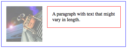
CSS float layout, now with container border fixed
The content used for this is available as a float demonstration. You can launch Firebug and have a play around with disabling the CSS styles to see how it works.
The next article in the series will cover how we use all the CSS techniques covered so far–floats, positioning and the box model–to create useful page layouts.
